The Strange Case of Coronavirus in Argentina
A close examination of Argentina's official coronavirus data updates uncovers some strange anomalies. Has the government (and the media) been veiling the true significance of the data?

This paper has been produced to:
Record and share a comprehensive story of the Covid experience in Argentina from March 2020 to October 2021, based in official data and publicly available reports and articles, but which also includes observations from ‘on the ground’.
Raise questions about the Argentine experience that are pertinent locally, but which may also have wider relevance. and
Document some sources and methods available to citizen researchers in the hope that more people will document and share the history of this unique period in their own countries, raising their own relevant questions.
Getting started
Argentina’s Ministry of Health regularly provides an interactive summary of key Covid data on their website. These “Información epidemiológica” reports (or parts thereof) are then regularly published by the main daily newspapers, in print and/or online. Here, I examine the Ministry’s public presentation of information as at 13 October 2021.
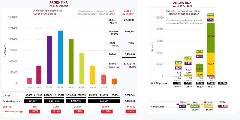
The page has been archived for that date but, unfortunately, the archived version does not make accessible the underlying data for that day, and the ‘live’ page it was copied from now contains new data — as it is regularly updated (presumably from a live database). To get around that problem I have copied each of the diagrams and graphs, and manually annotated them with the appropriate underlying data. This creates images that are cluttered, and rather small, but which can easily be related to their source.
Don’t panic. I also provide the same data in more accessible forms for those who wish to check it, and/or play with it. I wish I had saved detailed data from earlier dates to compare it with, but no. Sorry.
Here is the first set of information presented in the regular updates. The table did not record the date (which was “today” — the date of access), but did record the time last updated. [Note: This absence of date seems to have since been remedied.] The compilers also use no separators, so it is difficult for viewers to relate to the magnitude of the larger numbers.
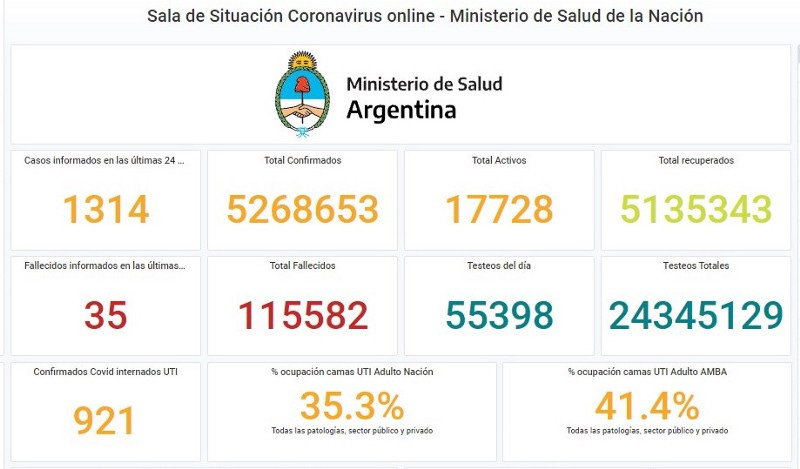
The key data from that table are (from left to right, and top to bottom):
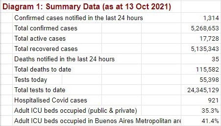
Other key data are:
Population of Argentina (approx) 45,737,000
Median age is 31.5 years
Total doses of vax given to date 54,353,322, with 52.7% (23,783,240) of the entire population having had two doses and 14% (6,403,180) more having had only one dose . Confirmed here.
Vaxxes approved in Argentina, in order of approval, are:
- Sputnik V: ordered 3 Nov 2020. “I’ll be the first to take the vaccine, I’ll do it before anyone else so no one is afraid of it,” President Fernández promised (10 Dec 2020), which he did (20 Jan 2021) — soon after which he tested positive for Covid, with mild symptoms (3 Apr 2021).
- Astra-Zeneca: produced locally (12 Aug 2020), approved (Dec 2020)
- Covishield: approved (10 Feb 2021)
- Pfizer/BioNtech: conducted testing in Argentina from July 2020, but approval long delayed because of “abusive deals” (11 Apr 2021 updated 20 Oct 2021), including requests by Pfizer for control of Argentine bank deposits and military bases as collateral.
UPDATE: See “The Pfizer Clinical Trial in Argentina Was a Military Operation” (22 Feb 2023).
- ModeRNA: used, along with Pfizer, for adolescents from 23 July 2021
- Sinopharm: arrived June 2021, approved 1 Oct 2021 for children 3–11, but not yet being offered (as at 19 Oct 2021).Vaxxes were first made available in order of perceived need, starting with
- healthcare personnel, followed by
- seniors (roll-out for people aged 70+ began mid Feb 2021 and vaxxing of 60+ largely completed by the end of May 2021), and
- other age groups, working down from seniors, with those in delicate health (with comorbidities) given priority in their age group.By 4 Sept 2021, the government announced that: “In the City of Buenos Aires, 93 percent of people over 18 years of age received at least the first dose , while 46% completed the schedule with the two immunizations.”
By Oct 2021, anyone who still wants a vax can make an appointment and receive it at no charge. After which, according to the Minister of Health (26 Oct 2021), the vax rollout will start all over again in Dec 2021— with booster shots.
The key data table (reproduced above) is accompanied by four interactive graphs. I propose to discuss three of them. In the versions shown to the public by the press, no interactive data is available (one has to go to the government website for that), so the impression provided by their basic format is important.
Here are two of them, addressing total confirmed cases:

What first impression do we get? First of all, the coronavirus cases seem to be pretty well balanced between men and women (with a tiny group of “others” or entries with unrecorded gender). There are a few more women than men, but the difference seems immaterial. Secondly, it seems clear that coronavirus affects everyone — with lots of cases affecting working age adults, and fewer at both ends of the age spectrum. (The legend for the age groups is offset from the data, making it hard to match them.) It seems intuitively obvious from these graphs that vaxxing across the full age spectrum makes sense as this is a problem shared by the whole population.
The third graph addresses deaths, by age and gender:
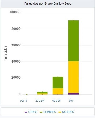
This shows lots more deaths after 60, as we have been led to expect. The balance of males (hombres) and females (mujeres) seems slightly uneven, but nothing calls our attention to this. The “others” (otros) category is placed under the female category, lifting it up in the final bar of the graph.
This unremarkable graph fits with the world as we know it (older people die more) and likely receives little attention from the general public.
A closer look
Taking the test
I first began to search for underlying data when I realised that Argentina seemed to have a very high percentage of positive cases. The basic data tells us that, to date, 24,345,129 tests have been done, with 5,268,653 (21.64%) of those being classified as confirmed cases. This seemed much higher than many other countries in the news.
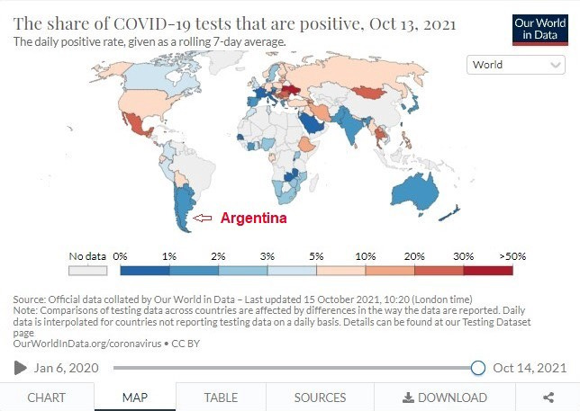
What I found was that the high positive test rate, suggested above, is a meaningless mashup of very variable positive rates over time. The current positive test rate for Argentina is recorded on this map as between 1% and 2% (actually 1.9% as at 9 Oct 2021 — per the underlying data).
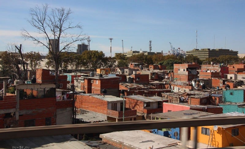
Argentina has had a rigorous testing programme from very early on. By June 2020 it had developed a form of cheap, rapid testing that could diagnose asymptomatic people, using mainly locally sourced materials. Early testing initiatives in Buenos Aires (which included serology tests) focused on the public transport hubs (three large train stations for people coming in from the province, together with the city’s underground subte system), and the villas (effectively the slums).
An early seroprevalence survey (August 2020) was also done, although press coverage of this seemed a little confused, and I have not seen any final results announced. (More on seroprevalence later.) One indication was given, though, from the pilot study done in Villa 31 — the large slum in the heart of Buenos Aires that is home to more than 40,000 people:
‘The case of Villa 31 highlighted the need to know how this virus evolves. … It was verified that 53% of [that] population generated antibodies for Covid-19.’
I asked myself why Argentina would have such a high positive rate from its testing for “cases”. Could the testing regime be generating false positives? Russia’s RT also queried the very high percentage of positive cases from testing (6 Oct 2020), but no explanation seems to have been forthcoming.
Two weeks later, Clarin reported (19 Oct 2020) that Argentina “exceeded one million infected and 26 thousand dead, with 215 days of quarantine”. That report noted the deaths for the day — 251 men and 198 women. This (and other daily reports) should have rung an alarm bell about gender disparity, but that bell faded away under the cacophony of alarms about the total death count, and the growing publicity about the vaccines to come.
Before I found a detailed record of the fluctuating positive case results, I noted that — despite the solid sounding “confirmed cases” — there had been a variety of definitions for that term. Initially it was conferred based on symptoms — which could also have been symptoms of colds or influenza. After the various testing technologies arrived, or were created locally, some short-cuts were adopted — after all, this is a large and populous country that is rather short of funds.
On 7 August 2020, an expanded definition of a “confirmed case” was announced:
“People with symptoms that are close contacts of a patient with coronavirus will be considered as a positive case and a swab will not be indicated. …”
“From now on, a person who falls within the category of a suspected case in a community transmission area [most notably the villas] and, in addition, lives with a person who has been confirmed by a covid laboratory becomes a “confirmed case by clinical epidemiological link”.
The new definition may help to explain the number of children noted as cases — a simple cold in a child may be registered as a “confirmed case” if one of the adults in the household has returned a positive Covid-19 test.
At that point (7 Aug 2020), 220,682 (49.2% women and 50.8% men) had been noted as confirmed cases, after 794,544 diagnostic tests (ie 27.8% of tests were positive), with 4,135 recorded as dead from (or with) coronavirus.
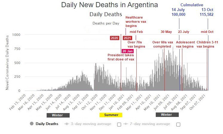
There are public international sites that maintain data across countries, and allow the user to call them up by various parameters. This is a picture of Argentina’s positive test percentage since the begin of the Covid outbreak (annotated by me with some basic data from the vax timeline). I have also added a visual indicator of seasons, as they are the opposite of northern hemisphere seasons, making data comparisons potentially misleading.

What at first seemed an anomalously high positive test result (of 21.64%) turns out to be a mashup of figures from as high as 41.8% (29 Sept 2020) and as low as 1.9% (9 Oct 2021).
The hardest data — the deaths
Tests results can be wrong — false positives, or wrongly keyed to some other virus, or even deliberately falsified. But a dead person leaves a dead body. It is hard to be wrong about the death count (although possible to be wrong about the cause). Funeral directors, as well as hospitals and the government, keep count.
[The funeral director] affirms that he has statistics — corroborated with his supplier of coffins- that show that at the beginning of the pandemic the level of deaths dropped by 60 percent , because “people stayed locked in their homes, we drank alcohol until in the pupils, there were no accidents, drowning or old people with the flu dying of pneumonia ”. There was a period of between six and eight months in which “the funeral homes were without rendering services because people did not die .” Now, in the middle of the second wave, there is an “upward curve”.
- Anonymous funeral director (13 June 2021) [Original emphasis]
At the point Argentina first “locked down” (midnight 19 March 2020 ), it was reported that “at least three people have died after being infected with Covid-19 to date”, the first having done so on 7 March 2020.
By 14 July 2021 (mid winter), 16 months later, the country met the “grim landmark” of 100,000 deaths — the 5th in Latin America to do so. The AFP news agency reported infectiologist and epidemiologist Hugo Pizzi:
In recent weeks, Argentina’s infection rate has slowed, while its mass vaccination campaign has picked up speed. Yet worldwide, the country now ranks eighth for confirmed cases and 11th for fatalities. For both cases and deaths per million inhabitants, it ranks 13th. It is now the fifth country in Latin America to record 100,000 deaths.
“From the epidemiological point of view, I cannot find an explanation [for it]. We are a team of 60 researchers who work, manage and advise all the hospitals in the country except in Buenos Aires, but there is no explanation” for this death toll.

The images from the “March of Stones” reminds us that any death is a tragedy for those involved. That does not mean, though, that death is avoidable — it will reach out for us all at some point. What we are looking for in our maze of statistics is clues to who (as a group) will die from Covid, how, when, and very possibly, why?
Excess mortality
Before we move on to segmenting the death figures into age and gender categories, it does pay to consider the total number of reported coronavirus deaths in relation to total “all cause” mortality for the period. This allows consideration of whether the deaths from one cause, in this case Covid-19, are extra to deaths previously expected, or may simply be replacing deaths that were expected anyway.
Every country has an established pattern of death which, after adjusting for expected changes in population, allows deaths expected in the future to be forecast. The “black box” world of the insurance industry uses very finely grained details of age, gender and location to create the actuarial tables underlying their menu of policies. But more general estimates are available publicly for many countries. [The difficulties of providing such data are discussed by Karlinsky and Kobak (30 June 2021), and a general discussion of excess mortality statistics is available at Our World in Data.]
Unfortunately, it appears that the required data for all periods is not available to public tracking sites for Argentina. Despite that, here is an estimate of excess mortality for 2020. (Other countries have data mapped up to 2021 on that site.)
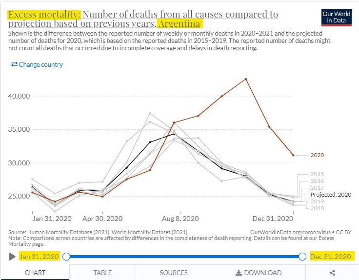
As can be seen above, despite a very strict lockdown (and any deaths that may have caused) and rising deaths reported as due to coronavirus, actual total mortality did not begin to rise above that expected from past patterns until August 2020. The steeply rising trend, from August to October 2020 roughly corresponds with the Argentine winter.
To put the known excess deaths in Argentina in perspective, here are comparable figures for the UK and Germany (which have opposite seasons) and Mexico (also north of the equator)— which all have data for 2021 included, mapped alongside Argentina, with data only for 2020.
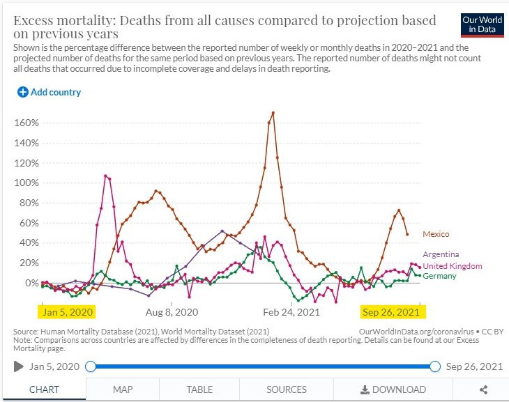
As noted by Karlinsky and Kobak (30 June 2021), it cannot be assumed that any excess deaths are all due to the coronavirus outbreak:
“Conceptually, excess mortality during the COVID-19 pandemic can be represented as the sum of several distinct factors:
Excess mortality =
(A) Deaths directly caused by COVID infection+
(B) Deaths caused by medical system collapse due to COVID pandemic+
(C) Excess deaths from other natural causes+
(D) Excess deaths from unnatural causes+
(E) Excess deaths from extreme events: wars, natural disasters, etc.”
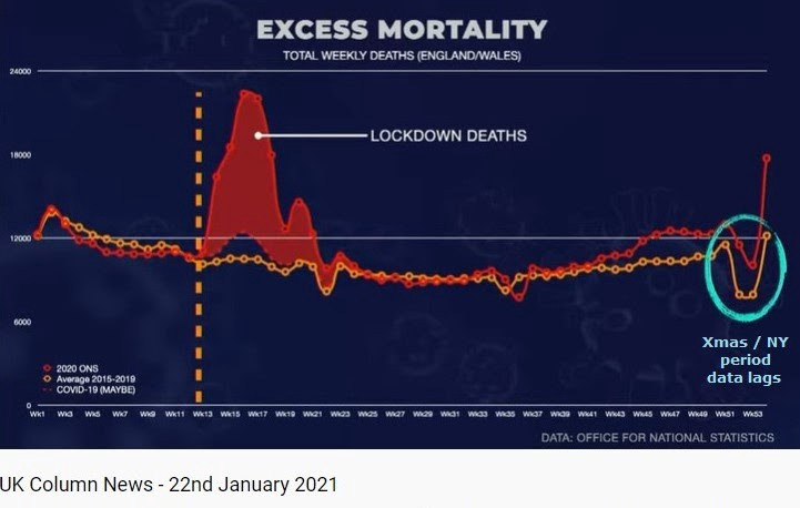
For comparison, here is an analysis of UK excess deaths in 2020, as discussed on the UK Column livestream (22 Jan 2021). As can be seen here, those commentators believed that most of the (winter) surge in excess deaths experienced in the UK early in 2020 was actually caused by lockdown policies. They also note the effect that data lags (eg Christmas / New Year 2020) can have on recorded results. [The original broadcast has been removed by YouTube, but is preserved on their website. The relevant discussion starts at 4:44.]
Place of death
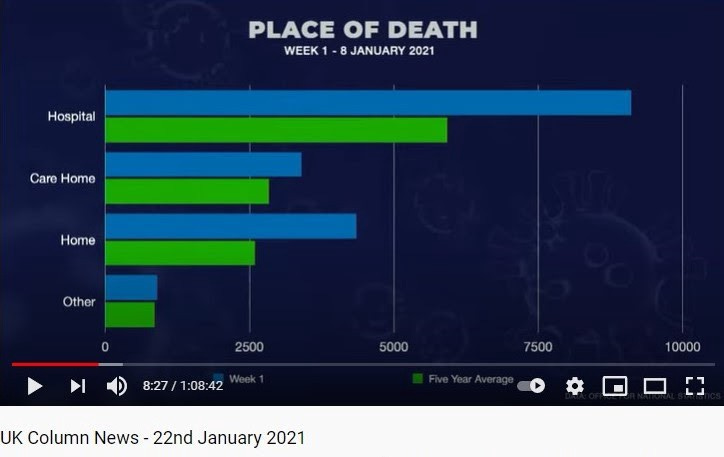
Interestingly, on the same episode (22 Jan 2021), UK Column also noted the place of death in the first week of January 2021, as recorded in UK statistics:
This was recently followed up by government figures from the UK Office of National Statistics [ONS], with a look at excess deaths by place over the whole period (from 7 March 2020 to 8 October 2021):
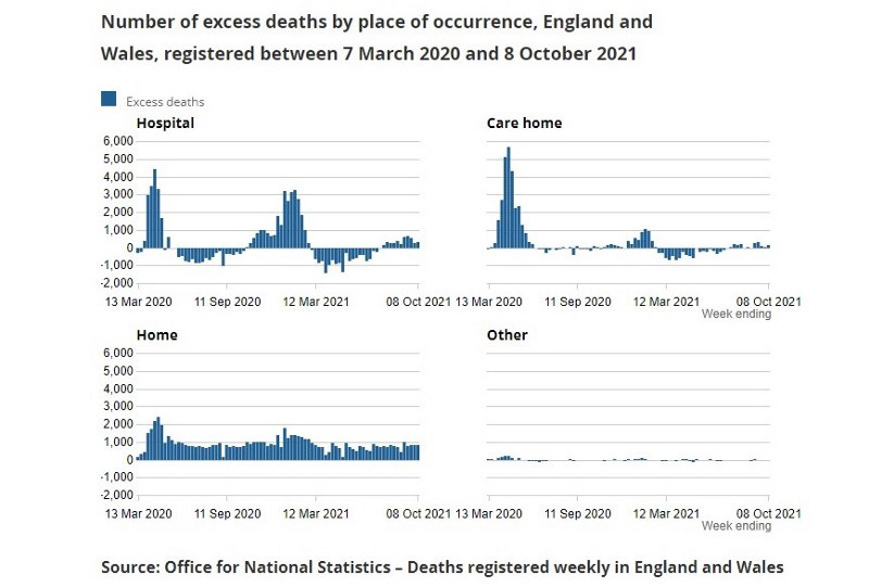
While UK deaths in hospitals and care homes had, at times, dipped into negative values, excess deaths at home have remain stubbornly positive for the entire period of the “pandemic”. This was discussed on the UK Column (20 Oct 2021 from 12:46) in the context of UK government plans for Covid measures over their coming winter.
I recall a discussion in Argentina reported some months ago, focused on data anomalies here, that indicated that a large percentage of Covid-labelled deaths were taking place at home (en casa). From memory, this came to public attention because it was noticed that hospital death statistics for Covid, collectively, were well short of total deaths recorded in the official count. Unfortunately, I have not been able to track down that record for inclusion here. If I find it later, I will add an update.
The place of death can be very relevant to identifying the cause of death. In some countries (such as the UK, US) much of the early death toll has been attributed to infection being introduced (accidentally or via policy choices) into places where those most vulnerable are concentrated — the care homes, in particular.
But deaths at home indicate something different.
Either the end of life was expected (eg due to long illness) and a family or patient choice was made to die at home.
Or the death was caused by a sudden event that could not be overcome by prompt emergency treatment (eg some strokes & heart attacks, or accidents)
Or, in the case of an acute illness (like Covid),
- the patient was too afraid to go to hospital to get help,
- and/or they were unable to access hospital services.
What information exists about place of death for Covid patients in Argentina?
Such data would preferably be broken down by age and gender.
Deaths by age and gender
This is the graph published by the Health Ministry showing deaths to 13 Oct 2021, segmented by age and gender. In this version I have annotated the original graph with actual figures available at that date underneath the interactive version. (My apologies for your need to squint at it.)

Here are the same figures, presented in several tables in a more readable form:

What began as a fairly unremarkable bar graph, is now displaying some very interesting information, related to deaths by AGE and GENDER.
Deaths by Age
Children and adolescents under 19 make up only a very tiny proportion (0.14%) of the dead, and the pre-middle age adults (20–39) are a further very small proportion (2.97%). This means that almost all of the deaths (96.89%) are made up of the over-40s — the 40–59 age group (18.82%) and the over-60s (79.07%).
What started as virtually a normal curve of “confirmed cases” has mutated into a spread of deaths vastly skewed toward seniors. Since the 40–59 age group concatenates the experience of a large age band, it might even be true that most of the deaths in that age group are of people closely approaching senior (60+) status.
This has to mean that vaxxing the under 40s cannot be for their benefit. It must be mainly, or even solely, for the benefit of the older age groups — ie to prevent transmission to them — something which has not been achieved by any vax so far: even the Argentine president tested positive within months of getting vaxxed (3 Apr 2021). While some might think that a desirable objective, others — Dr Bret Weinstein, evolutionary biologist, among them — have pointed out that making children and adolescents take the risks involved in an experimental product solely to protect the sick and old has been considered highly unethical, and forbidden until now:
“What society puts children at risk, robs children of life, to save old, infirm people? That’s upside down.”
England’s Chief Medical Officer, Professor Chris Whitty, on 13 September 2021, also made the point (in a very longwinded way) that vaxxing children should not be justified on the basis of its impact on adults and wider transmission, but rather on risk / benefit to the child. However, having admitted that the scientific advice was that any net benefit to healthy children was, at best, marginal, he then muddied the waters by using “disruption to their education” as a kind of thumb on the scales, despite the fact that past disruption was caused by government policies, and not by the virus itself — a very clever bit of obfuscation.
Deaths by Gender
While people generally knew, at least tacitly, that most of Argentina’s deaths were among the elderly, especially those with co-existing conditions, more surprising is what has now been exposed about the gender disparities in Argentina’s death statistics.
A much larger percentage of the deaths so far (65,662 or 57.34%) have been in male Argentines, with many less (47,598 or 41.56%) experienced by female Argentines. While this disparity has long been apparent in the daily death counts (where gender breakdown is given for the day), attention has has not been called to the mounting totals by the way the statistics are presented to the public, and I am not aware of any mainstream media articles on this topic. (I might have missed them, of course.)
A very early (26 March 2020) report from Italy’s Istituto Superiore di Sanità [ISS] indicated, as explained in a commentary in English, that “the case-fatality rate for men was 66% higher than the case-fatality rate in women”. This was, of course, from a very limited sample.
In the US, John Cullen has regularly called attention to the gender disparities in their statistics, along with being the first to report (20 Oct 2020), in a video since deleted by YouTube, that when Covid-19 appeared, influenza seems to have disappeared — worldwide. Unfortunately, he is generally viewed as a “conspiracy theorist”, so his data analyses are not often given the credit they deserve (despite his having been the original designer of the data mapping system that underlies the now ubiquitous Johns Hopkins map, and thereby an expert in accessing its underlying data).
Some scientists have also linked the severity of the Covid-19 disease, and therefore deaths, to androgens — male hormones (5 June 2020):
“We think androgens or male hormones are definitely the gateway for the virus to enter our cells,” said Professor Carlos Wambier from Brown University, the lead author of the latest study. “We really think that baldness is a perfect predictor of severity.”
But, to my knowledge, there has been no general publicity that Covid-19 might be much more dangerous for men than for women, despite papers being published that pointed this out as early as April-May 2020. One of those (from Tanzania) speculated as to reasons for the gender gap:
“While it is still too early to determine why the gender gap is emerging, this article point to several possible factors such as
- higher expression of angiotensin-converting enzyme-2 (ACE 2; receptors for coronavirus) in male than female,
- sex-based immunological differences driven by sex hormone and X chromosome. Furthermore, a large part of this difference in number of deaths is caused by
- gender behavior (lifestyle), i.e., higher levels of smoking and drinking among men compared to women. Lastly, studies reported that
- women had a more responsible attitude toward the Covid-19 pandemic than men. Irresponsible attitude among men reversibly affect their undertaking of preventive measures such as frequent handwashing, wearing of face mask, and stay at home orders.”
[NB: Layout of the paragraph has been changed for emphasis]
I will have more to say later about social / psychological factors related to gender that might be in play here.
The age group in our 13 October 2021 data where the gender difference was most marked (ignoring the tiny group of deaths among children) is the 40–59 age group (13,854 or 64.3% male deaths versus 7,533 or 34.96% female deaths). In other words, 83.9% more (or nearly double) the number of males 40–59 died of (or with) Covid-19 than females in their age cohort. Is this not a newsworthy fact?
In the largest group of deaths, the 60+ group, the difference was also marked, but not as extreme: 49,748 or 55.64% males to 38,621 or 43.20% females — ie 28.8% more men than women died in that age group.
What could explain such a discrepancy?
Gender based biological factors,
Individual lifestyle or behavioural factors,
Gendered elements in the society at large, and/or
Demographic factors.
The paper from Tanzania quoted above commented on the first two of these, and I will comment on the third later. Let’s go now to the final possibility. Are more males dying in those age cohorts simply because there is a higher proportion of men in the population?
Demographic factors
At the moment, having an ongoing, exact demographic breakdown of any country’s population is still pie in the sky (although this might not remain true if the World Economic Forum [WEF] has its way, and our identities can be tracked online, and in real time — via smart phone and banking data). Exact figures on a given date can be ascertained from a full census (one is planned in Argentina for 18 May 2022)1, to which are then added and subtracted figures from ongoing records such as births, deaths and immigration. Unfortunately, as time marches on, such virtual counts become less and less reliable. International bodies track trends for all countries, and extrapolate from the latest census based on known trends, to create approximate demographic pictures at various dates.
Here is one of those extrapolations for Argentina in 2021, with the data hidden under the online, interactive graph extracted and tabulated:
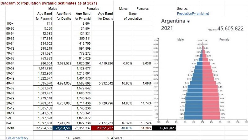
To be more succinct, here are the key figures after the population pyramid figures have been converted to the same age bands as the Ministry of Health uses for its death figures:

At the date for which data is being analysed (13 October 2021), there were expected to be slightly more males in the population up to age 39, but from age 40 onwards there would be more females than males — markedly so from 60+ years. In total, approximately 1.1 million more females than males were expected in the current total population. This is iteratively related to the lower life expectancy at birth for males — 73.9 years for males and 80.4 years for females. On average, men die younger than women.
So, the higher death rate for men in the 60+ age group could be, at least in part, simply a reflection of the sad fact that men in that cohort have met their earlier “use by date” — as expected. If it hadn’t been Covid-19 that had accompanied some of them (1.64% of that age group) to their end, it would probably have been something else. Using the same logic, women have a later “use by date”, so the smaller percentage of their cohort that died of/with Covid-19 (0.937% of their cohort) is simply reflecting that fact.
But even if that explanation were true for the senior cohorts, it does not explain the much larger difference in the 40–59 age group — a time we think of as the prime of life. Here, 0.278% of men in that age group died of/with Covid-19, in comparison to 0.141% of women in the same age group. While both are tiny proportions of all men and women 40–59, population demographics cannot explain why nearly double the proportion of men are dying of/with Covid-19 as women.
The same logic applies to the very small number of deaths in the 20–30 age group (males 0.028% to females 0.021%), while the miniscule number of deaths under 20 years makes any analysis meaningless. I have ignored the gender category of “other” in this discussion as the numbers included are statistically meaningless.
The point here is to raise issues and questions that arise from the data for a reasonably well educated, ordinary citizen. I have no doubt that demographers and epidemiologists could add meaningfully to the above discussion, and I would welcome that.
Before we leave this section, let us consider all three elements together for a moment: Population, Cases (which we will look at soon), and Deaths.

Let us first remember that the most error-prone element here is the “confirmed case”. Early on, this label was used for those people with symptoms — which could well have been something other than Covid-19 (eg the common cold, flu). Once there were instruments for detecting Covid-19 (symptomatic or asymptomatic), errors may have been due to the test instruments themselves —they could have been faulty, or simply looking at only one criteria (eg an asymptomatic carrier of the Covid-19 virus might be showing symptoms of (say) co-existent flu, for which they were not tested). Further, people who showed one or more Covid-19 symptoms living with someone who had tested positive for that virus was also listed as a “confirmed case”, without being tested themselves.
Now, considering all elements together (a kind of crude death rate):
3.72% of ALL <20s are confirmed cases, and 0.001% of them died
16.82% of ALL 20–39s are confirmed cases, and 0.025% of them died
16.53% of ALL 40–59s are confirmed cases, and 0.209% of them died
10.43 % of ALL 60s+ are confirmed cases, and 1.250% of them died.
Clearly, the number of “confirmed cases”, despite the pretty coloured graph the government shows regularly, is not — by itself — a good indicator of the actual danger of death for each age group, although it might be a good propaganda tool for the vax campaign.
The two groups returning the highest percentage of confirmed cases are the working age population (20–39 at 16.82% and 40–59 at 16.53% of their respective cohorts). Where did Argentina concentrate its testing , at least in the first part of the event (and at least in the cities)?
In the public transport hubs — almost entirely populated during the lengthy lockdown by able-bodied members of the working age population. (A special permit has been required to use these services almost from the outset.) And since those with jobs that could be done by tele-work stayed home, the travelling public were mostly members of the poor working class — key workers, taking care of essential services and the rest of the population.
The other focus was on the crowded conditions of the villas, peopled mostly by working-age adults who had to travel out to work —often in short-term contract manual labour, street vending, and domestic work for others. [Also children who could be caught up in the “confirmed case” definition, untested.]
So the high numbers in the 20–59 band may be more related to testing strategy than to actual case incidence.
By contrast, the oldest cohort — the 60s+, would seem to have been doing a better job of staying away from the virus, as a much smaller percentage (10.43%) of their cohort are reported as “confirmed cases” than the other adult age groups. (Or perhaps they were just staying away from the testers — unless they got very ill, and/or died. Many seniors were, and still are, terrified to go out .) But if the number of “confirmed cases” has been understated in the senior age group due to testing strategies, then the CFR (which we will come to next) will be overstated for this cohort.
Regardless, as a percentage of cohort, more than six times more of the 60s+ group died (1.250%) than in the 40–59 age group (0.209%). Whether that is a matter of biologic and/or medical factors, or something else, I will consider later.
Lastly, it goes almost without saying, because scientific papers have shown this over and over, that a very small percentage of children and adolescents (3.72%) made it to the status of “confirmed cases” — symptomatic or not — and a much smaller percentage (0.001%) of them died. A study from a tertiary pediatric hospital in Buenos Aires, covering 26 April to 31 October 2020, noted:
In the studied period 578 [pediatric] patients were hospitalized for COVID-19. The median age was 4.2 years and 83% had a history of close contact with a confirmed COVID-19 case. Regarding severity, 30.8% were asymptomatic, 60.4% mild, 7.4% moderate, and 1.4% severe. Among those with symptoms, the most frequent was fever, followed by sore throat and cough. […]
[O]nly one patient with COVID 19 died, due to causes other than the disease, since he was in end-of-life care.
It’s hard to say why most of those patients were even hospitalised, given what was recorded about their symptoms (or lack of them) — but it appears from the discussion that most of them were in hospital for other problems, with their Covid-19 diagnosis being added later, after a PCR test.
There is little support in these data for vaxxing children and adolescents.
The key epidemiological percentages
Case Fatality Rate [CFR]
The discussion above looked at an individual’s chance— out of the total population — of becoming a “confirmed case” — at least in the time period we are considering. This section looks at — once a person was classed as a “confirmed case” — what was the likelihood of them dying? This type of analysis results in “case fatality” statistics.
Here we return to the pretty, multicoloured bar graph provided by the Ministry of Health (shown above). This time, though, the graph has been annotated with the figures underlying it on the website.
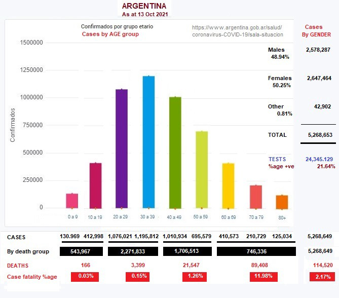
Here are the figures from that graph in tabular form:
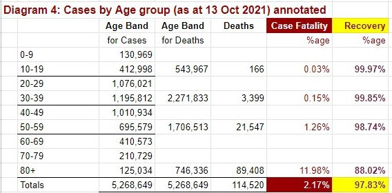
In order to determine case fatality [CFR], both cases numbers and deaths have to be for the same cohort — in this case, age group. So, although nine groupings were provided for confirmed cases, I have had to compress them into the same four age groups that were used to report deaths. We would get a richer picture if we had the same nine groups for the death counts, but one has to work with what one has.
“Case fatality” percentages are about the dead, but with Covid-19 most people (97.83%) who become “confirmed cases” survive the event — many with no (or only mild) symptoms, and some after hospitalisation. These are the recovered majority, represented by the “recovery” percentage.
On a personal note, I know only three people here who have received a positive result from a Covid-19 test. Two were in the working age brackets (20–59), one of whom had no symptoms at all, and the other stated that his symptoms were like mild flu. The third person was someone with a severe immuno-suppressive condition in the senior age bracket. She was hospitalised for about a week and received plasma treatment (developed here very early in the outbreak) and fully recovered. The cost of this treatment was covered by her health plan.
The confirmed case fatality percentage for the whole population in the Ministry of Health’s figures for 13 October 2021 (2.17%) is approximately that arrived at four days later (17 October 2021) by The Centre for Evidence-Based Medicine [CEBM] (2.19%) in their running updates for most of the countries represented on the Worldometers coronavirus database. (The small difference between those two figures can be accounted for by time lags in updating the various databases, and the small date difference.)
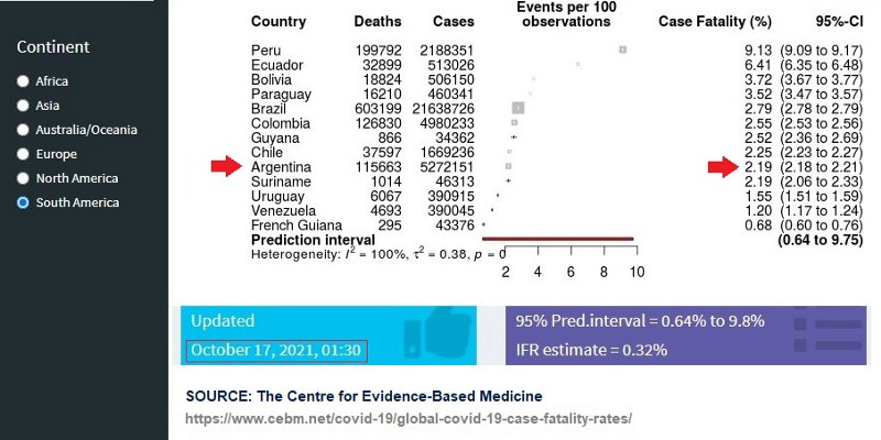
Some reference groups from other continents (from the same source) include:
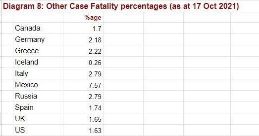
But what are we to make of the case fatality percentages for the different age bands? And what on earth has happened in the 60+ age group so that almost one eighth (11.98%) of those recorded as “confirmed cases” then died?
Is this a “reasonable” result? How does it compare to other countries?
[A reminder here that although the ‘fatality’ part of this percentage might be accurately counted, it is likely that the ‘confirmed case‘ numbers for seniors are understated due to testing strategy (discussed above), which would mean that the true case fatality percentage (CFR) for seniors would be overstated. See next section.]
It is difficult to find comparative figures for matching age bands, but some papers have attempted to provide such figures. One from Italy (25 Sept 2020) compared case fatality figures in 3 different months of 2020 (noting that these appear to be reasonably stable — at least at that time) and got CFR values of:
60–69 years - 9.5% to 10.9%
70–79 years - 24.1% to 26.7%
80+ years - 28.8% to 34.6%
Since the Ministry Of Health has not supplied death statistics here in those age bands, it is hard to do a direct comparison.
A German study, also from 2020, gave a very different result, showing that the CFR there was falling for the older age groups over the six month period studied.

The German article is of particular interest since Germany currently has almost the same overall CFR (2.18%) as Argentina (2.19%) — see tables above. It would be very interesting to follow through with a fuller comparison.
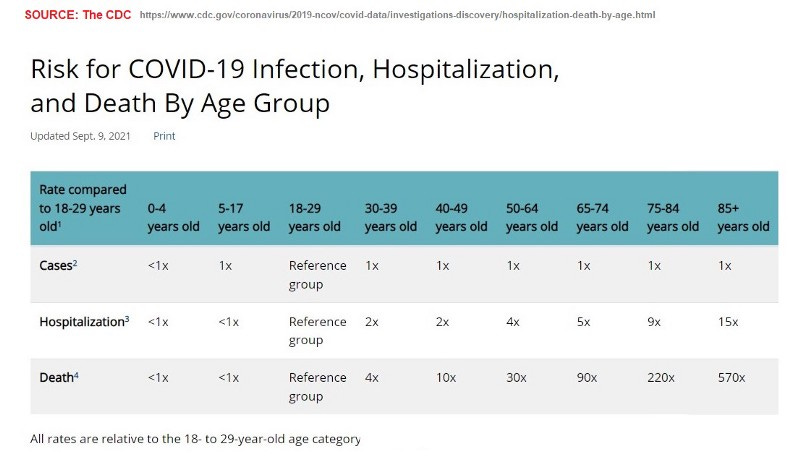
The CDC address the question of case fatality risk differently, and in age bands that cannot be matched to either the case or death data available to us, so their formula is not much help in answering our questions.
We, like so many citizens of so many countries, are left asking ourselves:
Are we doing the best we can for our senior population?
Are those with confirmed cases dying simply because of
- the disease: ie because of biological factors, and/or
- the treatment (or lack thereof): ie because of medical factors?Or are other factors contributing to this massacre of our seniors?
Infection fatality rate [IFR]
Confirmed case fatality statistics [CFR] (discussed above) address those who have been identified and confirmed as having:
- the virus (ie asymptomatic carriers)
- or the disease (ie symptomatic patients).
NOTE: The correct terms are SARS-CoV-2 for the virus and Covid-19 for the disease caused by the virus. Coronavirus is a generic term for a collection of viruses which include SARS-CoV-2 and the common cold. Despite all that, I generally use only Covid, Covid-19 or coronavirus in this discussion, all as referring to this experience, as those are the terms most in colloquial use here.
“Confirmed cases” are not the only people who may have the virus. In fact, past experience has shown that it is very likely that a much higher proportion of the population have (or have had) the virus, but they have not yet been identified and confirmed as a “case”. The Center for Evidence-Based Research noted, in relation to the “Swine Flu” epidemic (H1N1) of 2009:
The overall case fatality rate as of 16 July 2009 (10 weeks after the first international alert) with pandemic H1N1 influenza varied from [CFR] 0.1% to 5.1% depending on the country. The WHO reported that swine flu ended up with a [IFR] fatality rate of 0.02%.
An analysis of the new pandemic influenza A/(H1N1)pdm09 virus reported, a total of 18,631 deaths among the laboratory-confirmed cases, yielding a fatality rate [CFR] of 2.9% (95% CI 0.0–6.7%), with an estimated fatality rate [IFR] of 0.02% among all infected individuals.
These (and other) data suggest that the actual number of infections may be up to more than 100 times greater than the confirmed cases in a virus outbreak— because many infections are so mild they do not come to the attention of the health authorities (via illness or testing regimes) and, at least at the time of the outbreak, no reliable other form of ascertaining actual infection levels was in play.
That other form of testing is seroprevalence testing — a blood test that checks for antibodies to the virus being researched, showing that the person had been previously infected and their immune system had functioned as it was designed to do, resulting in partial or full immunity to further infection.
In some countries (eg the US) an individual can pay for a test of this nature. Indeed they have to, if they want to prove their natural immunity status where that is accepted as a valid alternative to having been vaxxed (ie in “vax passport” contexts). In other countries (such as New Zealand) such tests have been made almost impossible for individuals to obtain on demand. Use for public health research, though, is probably a different matter.
In order to establish the real infection fatality rate [IFR] in the population, sampling techniques are used to check the percentage of the population, in all relevant cohorts, that show this evidence of previous exposure (and hence some level of immunity) to the virus. A positive test of this type does not indicate a current “case”, but rather a current member of the protected population needed by that country to build herd immunity. In short:
- positive PCR test = bad news
- positive serology test = good news.
(Note: This ignores the role of T-Cells and other elements of the immune system, and the different impact on them of natural infection versus vax, but let’s keep to the basics.)

While identifying the IFR sounds simple, the reality is much more complicated, and has caused heated disputes among scientists in this and other virus outbreaks. It is really the IFR that encapsulates how serious a virus (or bacterial) outbreak is, and therefore indicates how serious public health responses should be. Consequently, scientists and public heath officials have both an intellectual and professional interest in arriving at the best assessment, and a potential ideological or political interest in arriving at an assessment that supports their view of the situation and their favoured policies for dealing with it. These may cause a conflict of interest.
Currently, there seem to be two main camps in relation to the global Covid-19 IFR. The first camp favours the analysis of Stanford’s Professor John Ioannidis, summarised here from his 13 July 2021 paper which focused, in particular, on the different outcomes for seniors in “care” facilities (such as nursing homes) and those dwelling in the community (in their own homes, or with family). This is relevant to Argentina’s social factors, which we will come to soon.

NB: An earlier paper (October 2020) from Professor Ioannidis: “Infection fatality rate of COVID-19 inferred from seroprevalence data” was published in the WHO Bulletin. In that paper he noted that:
“The infection fatality rate is not a fixed physical constant and it can vary substantially across locations, depending on the population structure, the case-mix of infected and deceased individuals and other, local factors”.
After many pages of discussion, Ionnadis concluded (as at Oct 2020):
“Acknowledging these limitations, based on the currently available data, one may project that over half a billion people have been infected as of 12 September 2020, far more than the approximately 29 million documented laboratory-confirmed cases. Most locations probably have an IFR less than 0.20% and with appropriate, precise non-pharmacological measures that selectively try to protect high-risk vulnerable populations and settings, the infection fatality rate may be brought even lower.”
Another camp considers the global IFR to be much higher, and believe public health measures of a more widespread and draconian nature are therefore justified. (This camp has been spurred on by the seriously unpleasant Dr David Gorski, who has — over decades — produced many vicious “debunkings” of scientists and medics who step outside the official narrative. His diatribe on the work of Professor Ioannidis can be read here.)
Many in this camp then point to the review and meta-analysis offered by Gideon Meyerowitz-Katz and Lea Morone (Dec 2020). Their paper indicates an overall IFR of 0.68% (with a range of 0.53%–0.82%).
If you scroll up this discussion to the Centre for Evidence-Based Research [CEBR] list of CFRs from South America, they note, in a box at the bottom of that page, an IFR estimate of 0.32% for that group. Here are their IFR estimates for all continents.
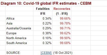
In their discussion, the CEBR authors note:
“We could make a simple [global] estimation of the IFR as 0.35%, based on halving the lowest boundary of the CFR prediction interval in Europe. However, the considerable uncertainty over how many people have the disease, the proportion asymptomatic (and the demographics of those affected) means this IFR is likely an overestimate.”
It is not for me to enter this debate. But I noted (above) that seroprevalence studies have already taken place in Argentina, starting quite early in the outbreak (see testing in Retiro 29 Apr 2020, and article 5 August 2020).
The smaller Villa 31 pilot study (18 July 2021) referenced in that article demonstrated more than 50% positive serology tests — PDF here.
One small study in the first three months looked at seroprevalence in 116 doctors, finding that “only 0.9 % [1 doctor] of the physicians from a children’s hospital had SARS-CoV-2 antibodies.”
Seroprevalence was also addressed in a 14 Jan 2021 article, but solely in the context of research into producing convalescent plasma for treatment purposes (also mentioned above). They state that:
“Over half a million tests have already been distributed to detect and quantify antibodies for multiple purposes, including assessment of immune responses in hospitalized patients and large seroprevalence studies in neighborhoods, slums and health care workers, which resulted in a powerful tool for asymptomatic detection and policy making in the country.”
Larger scale seroprevalence studies could produce (and may already have produced) a reliable IFR for Argentina, across age groups, genders, and socio-economic groupings. I have not seen any mainstream media follow up on that research. And of course, the seroprevalence water is now muddied by the massive vaccination campaign.
So we are left with a loudly nagging question. If Argentina already had a high positive antibody rate in mid-2020, as the tantalising glimpse shown us suggested, why has Argentina paid a very high economic price to vax ALL citizens, when those already exposed — the 5 million+ cases (11.3% of the population) currently recorded as “recovered”, plus any further people with antibodies (an unknown number) demonstrated via serology tests — already had a level of immunity that equals or surpasses that provided by the pharmaceutical products purchased?
And, as previously noted, the children and adolescents (another 14.5 million, or 32.1% of the population) do not appear to need it at all.
Why are we throwing money away, and asking nearly half the population to take unnecessary risks with their health from short and long term vaccine adverse effects [VAEs] when it seems they don’t need the vax?
Science and medical factors in Argentina
I am not going to deal here with the very complicated healthcare system in Argentina — that could be the topic of a whole other article. Suffice it to say that people in regular employment generally belong to a medical scheme via their union, with the cost shared between employer and employee. They then get medical, dental, mental and other health care as determined by that scheme - which may require attendance at a public hospital for some procedures. Those with sufficient funds can also purchase the private insurance of their choice.
All other people attend, generally at no charge, the public medical centres and public hospitals (managed at state level), which provide skilled care, but often in quite economically stressed circumstances. A paper (2011) which focuses on the healthcare system for seniors is available here.
The main problem I have personally experienced with the public health system is the endless effort required simply to gain access. Just getting an appointment (to see a specialist or have tests) can be a nightmare of endless early morning queueing — especially difficult for the ill. Oh, the irony.
[To illustrate: to see 1 specialist with 2 follow up visits, and have 4 different kinds of tests, it took me a further 10 trips to the hospital, queueing at 4 am for 3 hours each time, to get the necessary appointments.] It also requires putting up with the occasional martinet directing the walking wounded.
By contrast, my two experiences of public hospital A&E department visits have been less stressful— small wait times and adequate care. I have also visited a number of private clinics and hospitals with sick friends and, although the surroundings are generally nicer, I have not reached the conclusion that the standard of healthcare is of a much higher standard.
Of course, all that was prior to the March 2020 advent of coronavirus. I have no personal experience of what has occurred in the hospital sector since then — I am as reliant on the media as anyone else. But I do know that people were told at the start of the lockdown not to go to the hospital, and that message has never really been rescinded. And the patient management procedures in use in the public system before the outbreak — hundreds and hundreds of people queueing every day for appointments, all down the corridors, would simply not be possible in the current era of masks and social distancing.
By June 2020, staff in the public hospitals were saying that the system was not functioning well, and that standards were breaking down, and by 19 August 2020, patient groups were complaining about lack of access to treatment for other health problems, caused by coronavirus policies.
But what I want to comment on here is the great ingenuity shown by scientific and medical personnel (in a country already well known for medical breakthroughs) in the face of the general panic that the whole world felt when the “pandemic” was announced. During the first six months of 2020 both main newspapers (the “left wing” Pagina12 and the “right wing” Clarin) gave regular and enthusiastic updates about research and development that was occurring locally, and Clarin dropped its paywall for articles on these topics so everyone could have access. Topics included:
Using UV light to sterilise public transport — see photo (28 May 2020)
Development of of a “super mask” (12 Aug 2020)
The mask reportedly has a triple layer of protection — antibacterial, antiviral and antifungal — and a durability equivalent to 15 disposable masks. Note: Argentina has had an ongoing mask mandate since April 2020.Development of locally produced, rapid tests for Covid-19 infection (14 June 2020)
A lot of focus was placed on treating the infected, including:
Development of convalescent plasma from humans (3 June 2020), updated (16 July 2020). [Note: The World Health Organisation [WHO] then came out against this kind of product (August 2020), the day after Trump announced initiatives of this type in the US]
Antibodies produced via serum from horses (18 June 2020)
Paper published in Lancet journal (11 Apr 2021)Antibodies from llamas and eggs (20 Oct 2020)
Experimentation with inexpensive, generic drugs for prophylactic use and/or early treatment.
- Nebulised Ibuprofen (8 May 2020)
- Ivermectin Although studies were pioneered here (starting April 2020) by Dr. Hector Carvallo (see interview and transcript), the only mention I have seen of his work in local mainstream media (outside of Trial Site mentions 3 Sept 2020 and 26 Sept 2020) was a largely favourable article in Clarin (20 June 2021) after his study had been mentioned in a Lancet paper.
Note: Research started in Argentina on off-label uses of Ivermectin before the pandemic, as it showed much promise for use in dengue outbreaks , a problem here. Dr Carvallo had been involved in that research. The 2015 Nobel Prize acceptance speech from Dr Satoshi Omura had also drawn attention to apparent “Antiviral, Antibacterial, Anticancer” properties of that drug (p260).
UPDATE: See also “The secret plot to hide the efficacy of ivermectin in Argentina” (20 May 2023) - from the original article in La Prensa (30 April 2023) re the work of Dr Carvallo.
- While there has been worldwide academic and lay discussion on the usefulness of Chlorine Dioxide [ClO2] (otherwise known as MMS) as an antiviral, Argentina drew the line there. Laboratories were raided (12 March 2021) and Andreas Kalcker, one of the proponents, was charged with “illegal practice of the medical profession and selling fake medicines”. (4 Sept 2021)Development of a local vaccine (31 May 2020). Update (29 Jan 2021).
Towards the end of 2020, publicity about such innovative ventures seemed to dry up, with all news focused on the vaccines soon to arrive from the international “Big Pharma” corporations. Some of these were tested here (eg Pfizer) and others are now produced here (eg Sputnik V).
Social and economic factors in Argentina
There is more to living (and dying) than just one virus. People need healthy food, clean water, a home, positive human relationships, and some connection to nature. They need support and care when they are ill, and hope for the future. And, to lubricate the wheels of life, they need the financial resources to access at least the basics, and a medium of exchange that functions well.
Inflation
That last point addresses something that has long been problematic in Argentina. A recent report (12 October 2021) noted that:
“Argentine Central Bank’s latest Market Expectations Survey (REM) said 2021’s [inflation] outcome would be 48.4% and those are the figures the IMF currently uses during talks with the Argentine Government. […]
Venezuela (2,700%) tops the inflation list [but] average inflation in Latin America and the Caribbean area is 9.7% if Venezuela is left out of the equation.”
While that report went on to blame, in part, “the large vaccine gap”, inflation in Argentina has been very high, and chronic, for many years.
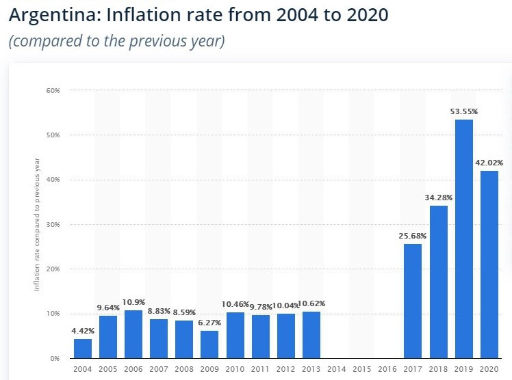
The Macri (“right wing”) government came to power at the start of 2016 — replacing the Kirchner (Peronista) (“left wing”) government, which had been in power since the total collapse of the economy in the crash of 2002. The Macri government was in turn replaced by the Fernández government (also Peronista) only months before the coronavirus outbreak began at the start of 2020.
A feature of the pre-Macri period was the rise of the “blue dollar” — a situation where US bank notes are routinely, but illegally, traded at much higher values in private exchange houses than in the official cambios. The blue dollar and the official exchange rate came into (more or less) parity for most of the term of the Macri government, but during the “pandemic” (the start of which coincided with the new Fernández government) the gap has greatly widened. As at 13 October 2021 the official exchange rate for the US dollar was 98.7 pesos, while the blue rate was 182.5 pesos (ie nearly double). These values have been fairly stable for most of 2021.
This peculiar arrangement means that those with access to foreign funds survive the galloping inflation rate better than those confined to local funds but, because inflation continues its upward climb despite the stable official/blue margin, even the privileged are now losing purchasing power.
[Note: As this paper goes to press (30 Oct 2021), a new initiative by the Central Bank of Argentina was announced that would allow tourists to access blue dollar rates legally. It remains to be seen how that would work out.]
Some effort is made to protect consumers from outrageous prices for basic goods, but my personal experience is that such efforts meet with little success. A trip to the grocery store is sufficient to incur PTSD, on a weekly basis. Other basic costs, such as building expenses (which tenants pay) have also skyrocketed.
Social Security
Economic distress in Argentina was endemic even before the coronavirus outbreak, with more than half of all children (52.6%) being brought up in poverty by early 2019, and “25.4% of households across the country [unable to] afford their basic food needs.”
And then along came Covid-19. By March 2021, “31.6 percent of households — or some 12 million people — were below the poverty line, unable to afford a basket of basic food and essential items”. INDEC defined poverty as “the inability to afford a basket of basic food and services valued at some US$600 [per month] for a family of four. People who cannot afford a basic basket of only food — about US$250 for a family — are classified as indigent.”
By mid August 2021, there were widespread demonstrations, as the never-ending lockdown had clamped down on many of the very limited activities which bring in the trickle of independent income available to the poor. At that time:
“UNICEF’s representative in Argentina, Luisa Brumana, highlighted that the government’s Emergency Family Income (IFE) payment was now reaching 47% of households, compared to 22 percent who initially received it in April 2020. “There are 13 million people living in 2.8 million homes, where at least one member receives the IFE [payment],” she said.”
UNICEF’s new report estimated that more than eight million children and adolescents in the country will be living in poverty by the end of the year. The UN agency for children forecasts that 2.6 million households have had their working income reduced as a result of Covid-19 and the lockdown measures taken to halt the spread of the virus.
In October 2021, yet another widespread protest, saw spokespeople:
“… denounce the lack of work, the lack of food and nutritional quality of the State provisions for the soup kitchens, the deterioration of the income of the beneficiaries of the social programs — currently at $AR 15,000 [per month, approx $US 150]— and restrict access to them.
In this context, they demand a public works plan for the generation of one million jobs, universalization and increases in social programs, understood as insurance for the unemployed, and an increase in the provision and improvement of the quality of food.”
While Argentina does have a basic social security support system, both the level of payments available (especially by First World standards), and the bureaucracy involved in accessing them, means that many people can barely keep the wolf from the door.
Pensioners and retirees, most of the 60s+ group, were given a little extra in August 2021, with a special, one-time payment of $AR 5,000 ($US 50), but this could hardly make a dent in the inflated cost of living — consumer prices having risen by 48.8% over the previous 12 months. The bonus was restricted to retirees “with an income lower than two minimum wages, or just over $AR46,000 pesos ($US460 per month)”, but in pointing out that this would mean that the bonus would reach “in total 83% of retirees and pensioners”, the government was also pointing out the general poverty of the senior sector.
“Raverta said the additional payment provided ”the certainty of a dignified retirement,” observing that since the government had taken office, a pensioner’s minimum income had risen from 14,000 [$US140] to 28,000 pesos [$US280] per month.”
Urbanisation
In 2020, more than 92% of Argentines lived in urban centres, up from 74% in 1960. The ten largest metropolitan areas account for half of the population, with about 3 million people living in Buenos Aires proper, and the Greater Buenos Aires metropolitan area totaling more than 13 million, making it one of the largest urban areas in the world.

Urbanisation increasingly means apartment living but, since apartment buildings have been endemic here for at least a century, they can be as low as four stories or, in the modern trend, many times higher. Buildings with six or more floors typically have elevators, but these add to the shared building costs (now skyrocketing) and may not always function. (Ours was out of order for 3 months during the lockdown, and I am aware of another close by which was out of order for about 3 weeks.)
While the functionality of many such buildings were intended to be overseen by a resident portero (concierge or caretaker), who usually has a small unit on the top floor, the rapidly increasing cost of wages and social security contributions for members of this very active union have seen many buildings dispense with this option, and opt for part time cleaners instead. This has left residents more vulnerable to delays in basic maintenance, and created an absence of overview of their basic welfare.
As a final blow to resident vulnerability, the general lawlessness of the 2002 economic collapse led many buildings to disable their street door lock release buttons in apartments, meaning that many residents must descend to street level to admit deliveries, medical assistance, or visitors. (This is said to prevent the admission of unauthorised persons but, when I suffered a brutal home invasion prior to the “pandemic”, I discovered that the three men involved were simply let in by my neighbours as they entered the building.) As the Liga del Consorcista have noted, this practice is illegal, but in many cases it continues.
Where do the over 60s live?
All of the above makes apartment dwelling a potential hazard to seniors, especially if they are frail, live alone or with an equally frail partner, and especially to the respiratorily challenged.
Many of these problems are overcome, at least in middle class homes, by having a live-in maid — a much more common arrangement here than in First World countries. Even quite basic apartments were (and still are) traditionally build with a “dependencia” for the “mucama”. These domestic workers cook, do laundry, as well as clean, and some are even involved in childcare or supervision. In return, they get food, accommodation, plus a wage and — when employed legally “en blanco” — employer social security contributions. (The ILO addressed problems in this labour sector in a 2017 report.) Many such employees are immigrants (usually from another Latin American country), and some are without proper documentation.
This arrangement is also a common solution to the need for elder care, as intensive residential care (“care homes” or residential “villages”) for the elderly is not a Latin American tradition. (This is a shock to many Anglo expats in the older age groups.) Per a detailed description of “geriatric care” in Argentina (2011), only 2% of senior citizens live in adapted housing, residential homes, or nursing homes. The balance live in their own homes (with or without live-in assistance), or with their families.
That report links this social dimension of Argentine life to the Italian and Jewish ethnic origins of many earlier generations of immigrants, and their emphasis on family care of the elderly. Having said that, they note that the Jewish community built a big, modern and innovative nursing home in Buenos Aires City in 2006, which includes a special in-patient dementia unit, an acute geriatric unit, and other facilities. And the Italian Hospital of San Justo have a modern hospital for acute care, a nursing home and a specialized care unit for those with advanced dementia. Daycare centres for the elderly have also sprung up.
Of course, living “in their own homes” for the remaining 98% of seniors may mean anything from a complete apartment, to a room in an “hotel familiar” — a Latin American equivalent to a boarding house, where rooms in a (generally old) building are rented out separately, and residents share bathrooms and kitchen facilities. In the local version, rooms usually open onto a shared courtyard, which can make them cold and damp in the winter. (I know this from personal experience, after a very miserable short stay in one not long after the big crash.) It may also mean living on the street — homeless numbers are growing, but this was already a problem under the previous government, before the virus outbreak (10 Sept 2019), when it was estimated that 10% of the population were living on the streets. The latest INDEC figures (4 Oct 2021) show that has now reached 10.7% (or 4.9 million people).
For those elderly who live in apartments (or houses) with live-in domestic help, it is possible that little changed during the great lockdown. They had someone to go out and shop for them, and/or accept deliveries. Cooked meals, clean laundry, and hygienic living conditions were provided as before.
But over the last decade, “live-in” domestic services have increasingly been abandoned in favour of part or full-time contracted workers who travel from their own homes (in poorer neighbourhoods) to provide more time-limited services. This shift, both in ordinary domestic support and, possibly, in elder support, occurred for a number of reasons:
Cost and flexibility — employers found “live-out” services cheaper, and felt more able to change staff at will (mucamas traditionally stayed with a family for very lengthy periods, often being referred to as “part of the family”),
Reluctance on the part of the employer to get caught up in the bureaucratic process of putting their employee en blanco — something on which the government was increasingly insisting, and
Increased desire for privacy — on the part of both employer and employee.
Then along came lockdown, and many domestic staff feared travelling daily across the city (even if they could get a permit to use public transport), and many elderly people feared having someone in their home who might import the virus. (In fact they were advised to be fearful, by the government spokespeople, and the media.) But without staff, many would have been faced, not only with the need to shop and do domestic chores themselves, despite whatever frailties they had, but also to complete activities they may never have done before, or no longer know how to do.
To be frank, it is my suspicion that many of the elderly died — at home — of hunger, fear, and unaccustomed neglect, no matter the Covid status on their death certificates. If their buildings had become dysfunctional (as discussed above) they may not even have been able to accept deliveries of food or medicines. I am not aware of any directive given to the well-paid corporate Administrations of thousands of apartment buildings that they should regularly check on the welfare of elderly and/or frail residents and notify someone (who?) if there seemed to be a problem. Neither am I aware of any advice from the portero’s union to their members that they might play a special (and active) role as “alarm bells” and/or “good fairies” for elderly and/or infirm residents should those residents seem to need unusual levels of assistance in these difficult times.
Somehow the “special care of the frail and elderly” that is talked about so much, internationally, has come to mean simply giving them the vax, whether they want it or not. One of the lessons we might all learn from this terrible experience is to rethink what we actually mean by caring for the vulnerable.
One of the lessons we might all learn from this terrible experience is to rethink what we actually mean by caring for the vulnerable.
Of course, not all elders live (or continued to live) in their own homes. Many live with family. While this would give them vital support with daily living, it would also expose them to any viruses the working/travelling younger members of the family brought home. It’s a “Catch-22”, as life so often seems to be.
I have focused on the living circumstances of seniors, especially those who are frail, since Professor Ioannidis pointed out (see above) that there seems to be a large difference in the IFR (and possibly the CFR) experience of those who live in institutional care, versus those who live out in the community. I hope that, at least retrospectively, we can analyse the Argentine data such that we get useful information on that topic before we endure another “pandemic”.
Gendered elements in the society at large
I already noted that there are four main possibilities that might explain why so many more males than females are dying from/with Covid, especially in the older (40–59) working age group. I discussed three of them above, but left the issue of gendered elements in the society at large for later discussion.
It is difficult, in today’s “woke” world, to discuss gendered roles in society without being viciously attacked. But Argentina is still a society steeped in machismo, so I will bravely venture into this topic. Outside my office window and across the street is a small microcosm of a typically gendered world — a building under construction. All work stopped as soon the lockdown was declared (19 March 2020), and did not recommence until the end of 2020. Everyone on that building site was male. That gendered reality was repeated, at various scales, all over Argentina (and much of the world).
Where women often get feedback about their self-worth from family, and via diverse forms of communication with them and with friends and co-workers, most men generate their sense of self-worth directly from other men — at work, in other interest groups (like sports teams or milongas) and via expertise in various topics demonstrated in discussions in social groups (eg at the local bar). Physical presence in work, sporting and social venues has been totally curtailed, or at least severely limited, for most men over a long period. It is more than likely that for many men (especially those without current partners), this has drained the colour and warmth from their world. And that will, in turn, have seriously impacted their immune systems, as well as their mental health. (Women have also experienced these problems, but most will have other avenues from which they can maintain their sense of self-worth and the integrity of their inner world.)
Further, especially in a macho society, women are better trained at physical maintenance of bodies (food, laundry etc) and homes. Where men have been living away from families, the loss of their capacity to visit places that provide healthy food (families and restaurants) may have negatively impacted their diet for long periods. Poor diet, too, will have a serious negative impact on the functioning of the immune system.
For those men who normally work outside (labourers, street vendors, etc), being kept from work and sports will have seriously limited their intake of vitamin D — with low levels having been demonstrated as being correlated with poor outcomes after Covid infection.
It could be that such societal and psychological factors, combined with Covid lockdown policies, have impacted more negatively on males than on females. Are there issues here that are worthy of more research?
Other issues
That ends my statistical analysis of the Argentine Covid esperience, but there are other issues reader might like to consider. I raise a few of them below.
Legal issues
Mandatory vaccination. This discussion has not focused on the Argentine rollout of the various Covid vaxxes in use, although I have included some key dates and statistics above. But it is worth noting that the Argentine population has been extraordinarily compliant with the government’s Covid vax agenda. This could be, in part, because the official vaccine schedule is mandatory in Argentina, and has been for some years (14 December 2018).
At the end of 2018 the Senate approved LEY 27491 [PDF here], a new law (with bi-partisan approval) that established a schedule of “mandatory and free vaccinations against preventable diseases” for all the inhabitants of the country, and provided that the complete vaccination card is required when applying for (or renewing) the DNI (national identity certificate), passport and driving licence. A report from that period noted:
“The Argentine is in general a person related to vaccination. The anti-vaccine groups in Argentina are very small and the idea is to keep it that way” said the deputy from Tucumán.
The new framework also provides that parents, guardians or legal representatives will be responsible for the vaccination of the people in their charge and, in the case of non-compliance with this measure, “will generate actions by the corresponding jurisdictional health authority, tending to carry out the vaccination, ranging from notification to compulsory vaccination.”
While the Covid vax is not yet part of the national vaccination schedule, there is no doubt that status is intended at some time in the near future.
[NB Argentina now has a database specifically for health legislation - see here.
The vaccination calender is here, and the vaccination card for adults in here.]
Anti-Covid Policy Protests. While there have been a number of “anti-lockdown” protests (as mentioned above) protest against the vaccines themselves appears to be minimal (although this may also be related to a lack of media attention to this issue, as has happened in many other countries).
Early in the outbreak one doctor, Dr Juan Avakian, Head of the ER at Allende Hospital in Córdoba, took to social media in a video which protested about the general policy approach to Covid (20 May 2020):
“You have to assume that it is logical that there are more cases, and you must know that 95 percent are mild cases. We have to be prepared so that 5 percent can be properly treated … How long are we going to continue to keep people locked up? Until a vaccine comes out? Enough of saying that this is to take care of our health. Health also involves the economy and mental health … Be consistent, let’s do the logical things, because instead of taking care of ourselves, they are making us all sicker.”
The doctor was not supported by his hospital. After his video (included in the article) went viral the hospital assured that “the hospital does not share at all the sayings of the head of the Emergency Dept of the institution. It is his personal opinion.”
By the following year, government Covid vax policies were more of an issue. On 28 May 2021, Mariano Arriaga, the leading ophthalmologist of the “Doctors for The Truth” movement, was released from jail by the judge after payment of a bail of AR200,000 and his commitment not to re-convene anti-vaccine acts or marches. The other two defendants — a Chaco councillor and a doctor from Mendoza — were also released. It appears that publicity about this treatment of dissident professionals may have had the desired “chilling effect” on “anti-vax” protest in Argentina.
Argentina’s historic experience of the consequences of dissent. While much of the population is too young to actually remember state terrorism under the military dictatorship (1976 to 1983), there is a visceral awareness here of the way a government can treat those who dissent. A simple walk along the city pavement reinforces that, as memorial plaques to the many thousands (some estimate up to 30,000) of desaparecidos (“the disappeared”) are set outside the homes and workplaces they were taken from. There are at least six such plaques, each for multiple people, within a few blocks of my home.

One of the first moves of the military government was to mandate a form of social distancing, with numbers in gatherings strictly limited, tango driven underground, and even restaurant table size minimised so the “virus” of dissent could not spread. The mirroring of these measures in the current climate cannot have escaped the notice of people, especially the elderly, though few speak of it.
The levels of fear generated (and continually stoked by politicians and the media) in the Covid era cannot help but resonate with a pre-existing, widespread, but thinly veiled angst, even if many aren’t conscious of this association. This too will be part of why the population is much more compliant with the “public health” measures imposed — especially the vax — than in some other countries.
Prison population. The issue of danger to prisoners from Covid spreading institutionally was raised very early on, and misinformation (fueled by press reports) led to a very noisy and widespread pot-banging cacerolazo (30 Apr 2020).
The irony of this negative outburst against prisoner release was that, until that date, a large percentage of Argentines (in Buenos Aires at least) had stood on the same balconies at 9pm each night to applaud medical staff for taking care of Covid patients. That practice faded away immediately after the cacerolazo.
Two weeks later (13 May 2020) a public debate was held about this issue. Most of the experts agreed that reducing the population of the prisons was important, and that especially those held on remand (ie not yet convicted) should be considered for home detention.
The death of tourism.
After the crash of 2002, one of the elements that led an economic resurgence was the great revival of tango — which had been repressed under the military dictatorship, and was in danger of dying as an art as its great proponents aged and died. With the post-crash resurgence (led by younger dancers), people flocked to Argentina from around the world to learn, dance, or at least watch tango. The rebirth of tango became the emblem of a growing tourism industry. [Ironically, the other form of burgeoning tourism was “medical tourism”, with North Americans and Brasileros visiting for dental and plastic surgery which was of a good standard and much cheaper here than at home.]
With no tango and locked borders, 2020 saw the death of tourism — or at least it fell into a comatose state. Even travel across the Rio Plata from Uruguay required a Covid test (10 July 2020). Although (somewhat half-hearted) efforts have been made to revive tourism from the end of 2020, most have fallen flat. Tango has restarted, but in a very stilted form — with masks, and no change of partners (is that even tango)? Apart from the general difficulties of world travel in the age of Covid, much of what ordinary tourists come here for has now dissipated. This has had a serious knock-on effect on the hospitality industry, including hotels and tourist apartments, and a subsequent effect on property sales (now flat-lined).
Another cultural icon — sharing mate (pronounced mah-tay).
One of the most pervasive cultural habits here used to be the communal drinking of mate. Where the English might stop work for a cup of tea, Argentines stop work to share this herbal drink, ingested through a shared metal straw (the bombilla). This can be seen in many formal places such as police stations, and even the president will refer to “stopping to share a mate” when a topic requires further consideration. No more! A considerable amount of publicity was produced to persuade Argentines to keep their mate to themselves.
However, biochemist Ana Thea, a research professor at the National University of Misiones, reminded locals that they must continue to enjoy the “healthy habit of a good mate, each with their team.” The habit should not be lost because mate “is a powerful antioxidant, source of vitamins, minerals and also an ally in the prevention of certain diseases such as type II diabetes, obesity, cardiovascular diseases and high cholesterol and triglycerides”.
According to the specialist, the most popular infusion “helps maintain a strong immune system prepared for various attacks”, even in times of health emergency.”
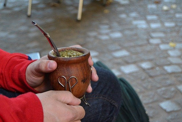
So, in the time of coronavirus (to echo Gabriel García Márquez), drinking mate may have helped the people of Argentina retain their health, even though sharing it can no longer be used to cement relationships. Has any research been directed at this?
In SUMMARY
This paper has been produced to:
Record and share a comprehensive story, based in official data and publicly available reports and articles, of the Covid experience in Argentina from March 2020 to October 2021.
Raise questions about the Argentine experience that are pertinent locally, but which may also have wider relevance. and
Document some sources and methods available to citizen researchers in the hope that more people will document and share the history of this unique period in their own countries, raising their own relevant questions.
Questions raised include:
Why is data not available to the international statistics compilers for “excess deaths” in Argentina after December 2020?
What information exists about place of death for Covid patients in Argentina? Such data preferably to be broken down by age and gender.
Why has so little attention been given to what seems to be excess mortality in males who catch Covid-19? What research is being done into this phenomena?
Why have testing strategies been so biased towards the younger, working population when there is universal agreement that it is the older, senior population that are most endangered by the virus?
What have been the results of the large scale seroprevalence tests done in Argentina (preferably broken down by age and gender)?
Why are we throwing precious money away, and asking nearly half the population (the official Covid recovered, plus others with antibodies, plus children and adolescents) to take unnecessary risks with their health from short and long term vaccine adverse effects [VAEs], when it seems they don’t need the vax?
Why has the government not coordinated with the Administration companies which manage most apartment buildings, the porteros union, and other relevant community-based organisations to ensure that problems experienced by seniors (and other frail residents) are identified promptly, so that help can be offered on a timely basis — especially during the lockdown?
Somehow the “special care of the elderly (and fragile)” that is talked so much about, internationally, has come to mean simply giving them the vax, whether they want it or not. One of the lessons we might all learn from this terrible experience is to rethink what we really mean by caring for the vulnerable.
The author of this paper lives in Buenos Aires, Argentina. This is a report from a local citizen, working from publicly available data and local knowledge. No claims are made to any form of special expertise. The report is shared in the spirit of open enquiry into our shared experience of a world-wide phenomena that has caused — and is still causing — an enormous amount of pain and distress, and as a contribution to our shared task of recording our history as it happens.
Also on Twitter at La Fleur Productions.
Thanks for reading this discussion.
This is my permission to republish it, preferably the whole story, unedited, and providing a link back to this article. Contact the author if you wish to discuss its contents.
All images are included either under “fair use” terms for the purpose of education, discussion and commentary, or belong to the author, or have appropriate creative commons licences.
UPDATE; Preliminary results from the 18 May 2022 census show:
”Argentina's population is made up of 47,327,407 people” and “also reveal that women make up the majority of the population, 52.83 percent of residents in total. Of the remainder, 47.05 percent are male, with the remaining 0.12 percent responding that they do not identify as either.“
UPDATE: A revised estimate from 31 January 2023 noted that there has been a large error in the first set of preliminary results:
“INDEC shares fresh data from last May’s census, showing national headcount of 46,044,703 – 1.2 million lower than previous estimate. According to statistics bureau, 51.76% of the population is female and 48.22% male. A total of 0.02 percent said they did not identify with either gender.”


Great detailed analysis! I'd add that in 5 different Argentine Government studies, 9 out of 10 who died WITH COVID were vaccinated:
Caso Argentina: genocidio COVID basado en evidencia
https://www.academia.edu/50940224
Esclavizados pero Felices: Gobierno Mundial Masón
https://www.academia.edu/85627428/
KorruptaMENTE: la corrupción total de la Argentina
https://www.academia.edu/85627881/
COVID cure or perpetual vaccination?: 30 cheap effective treatments or never-ending ineffective unsafe injections... Scientific proof of the PLANdemic with 2000 peer reviewed published references.
https://www.academia.edu/45000293
The full PLAN exposed:
https://scientificprogress.substack.com/p/the-plan-revealed
16 laws we need to exit Prison Planet
Politics got us in, politics is the way out ... after prayers!
https://scientificprogress.substack.com/p/laws-to-exit-planet-prison
Gates-WHO: vaccines can’t reduce population, except by murdering
Proof: they were never for reducing mortality, only for murdering!
https://scientificprogress.substack.com/p/depop-vaccines-no-myth
The threat of the WHO sovereignty-grab by the 2023 IHR and 2024 International PLANdemc Treaty: we’ve got until November 2023 for Congress to repeal IHR modifications!
https://scientificprogress.substack.com/p/the-threat-of-the-international-plandemic
FREE “wake-up” MOVIES !
15 million watched the first one in 3 days!
Watch as if your lives depended on it: literally!
https://scientificprogress.substack.com/p/wake-up-videos
Will Tedros EVER go to JAIL?
https://scientificprogress.substack.com/p/will-tedros-ever-go-to-jail
30 Spike Protein Treatments (COVID+Vx)
https://scientificprogress.substack.com/p/covid-treatments
The SUPER drug
Treats 25 viruses, cancer, multiple sclerosis, SPS....
https://scientificprogress.substack.com/p/the-super-drug
The REAL COVID timeline:
It’s Bio-BOMB, like the vx, not what you were drilled
https://scientificprogress.substack.com/p/the-real-covid-timeline
Bio-BOMB, not “vaccine”, not “gene-therapy”
This 5th gen war, includes a war on semantics.
https://scientificprogress.substack.com/p/not-vaccine-not-gene-therapy-just
What do bioweapons have to do with the Department of Energy?
Anybody answering these questions PLEASE ? !!!
https://scientificprogress.substack.com/p/what-do-bioweapons-have-to-do-with
Amnesty or JUSTICE:
https://scientificprogress.substack.com/p/amnesty-or-justice
Doc says: oops! I'm a complete IDIOT
https://scientificprogress.substack.com/p/doc-says-oops-im-a-complete-idiot
Making the taxpayer pay for his poison at Warp Speed
https://scientificprogress.substack.com/p/making-the-taxpayer-pay-for-his-poison
How to turn the AI into a COVIDIOT:
https://scientificprogress.substack.com/p/how-to-turn-ai-into-a-covidiot
The 2020 and 2022 rigged and stolen elections (it’s the machines!):
https://scientificprogress.substack.com/p/the-2020-american-coup
https://scientificprogress.substack.com/p/david-rockefeller-illuminati
J6: what THEY don't want YOU to know
The fake riot was mason-planned, incited and guided by FBI agents, who broke into the Capitol !!!
https://scientificprogress.substack.com/p/j6-what-you-need-to-know
Dominion over US
You can’t make this stuff up. Do they laugh in our faces? Was the name Dominion chosen to prove their dominion?
https://scientificprogress.substack.com/p/dominion-over-us
A Republic or a Democracy? Are we crazy to accept demo-crazy?
https://scientificprogress.substack.com/p/democracy-democrazy
It sucks! We need to improve democracy… how about REAL democracy?
https://scientificprogress.substack.com/p/reinventing-democracy
Green communism sucked 200 trillion from taxpayers:
https://scientificprogress.substack.com/p/best-scientific-sources-to-debunk
https://scientificprogress.substack.com/p/killing-me-softly-with-green-songs
https://scientificprogress.substack.com/p/carbon-reparations
https://scientificprogress.substack.com/p/climate-deaths
Open season for human culling:
https://scientificprogress.substack.com/p/electro-quakes
https://scientificprogress.substack.com/p/balloon-attack
https://scientificprogress.substack.com/p/satattack
https://scientificprogress.substack.com/p/toxic-spraying
https://scientificprogress.substack.com/p/water-poisoning-they-drink-perrier
https://scientificprogress.substack.com/p/the-myocarditis-mammoth-in-the-er
https://scientificprogress.substack.com/p/war-on-mothers-and-babies
https://scientificprogress.substack.com/p/adenovirus-covid-vaccines-caused
https://scientificprogress.substack.com/p/stealth-ultrasound-and-microwave